Wednesday, 22 June 2011

Found some old things


As I was sorting through my room I found some old drawings and paintings I did a few years back - from ALevel I think

Tess


I miss Tess. Best dog in the world....even though she never really did get the concept of fetch.

Going back a couple of years.


These were some photographs that I took and self developed back in college. I loved these photographs becasue they show the charisma of my good old friend Mitch.

My favourite photo is the top one of Mitch laughing because it was a natural, unintentional shot that I think works well.

Day to day photo


Saw the flower. Liked it. Took a picture of it.

Thursday, 9 June 2011

Bon Voyage!


I made these cupcakes for my friend Tor who is leaving for two months to go travelling round Asia.

Wednesday, 11 May 2011

Alphabet Design

 Poster

Hand Painted Alphabet

For my final project before assessment my task was to design a typeface and a typographic poster to represent a word. We were given a list of words and I chose wild. I wanted to be really illustrative with this project and try to keep away from the computer to an extent. So I created this alphabet which I hand painted of all different elements of wild animals for each letter.

My alphabet is aimed at children, I think that it works well and it was nice to be able to paint and I really liked thinking about how the typeface could be used in context of a children's book etc.

I designed two 'a's because one is a juvenile 'a' which is how children write but now there is the option of the 'a' to see which would be more appropraite.

I wanted the poster to be quite simple, so that the main focus really was the letter forms. I decided to focus on writing the saying " The quick fox jumps over the lazy dog" because it had every letter of the alphabet in, so therefore you can see how the letters work together as a word or in a sentence. I also think this saying is really appropriate for the theme of my alphabet because when children learn to write in school, they quite often write this sentence.

Tuesday, 10 May 2011

Work Experience

Ok, so over my easter holiday away from uni, I got the chance to spend a couple of days working in the studio with The Hidden Dingbat Collective. I helped out on a children's book that they are currently working on, mainly doing some art work bits, to help speed up the process. I had a really good experience working in a real design environment, meeting and speaking to other people in the industry. I would like to thank the Dingbat's for having me and letting me help out. www.hiddendingbat.co.uk

Thursday, 7 April 2011

Alternative Pub Sign


For this project my task was to create a pub sign that was lateral not literal, so in other words it couldn't be like normal pub signs where its called The Ram and then a lovely painting of a ram on it.

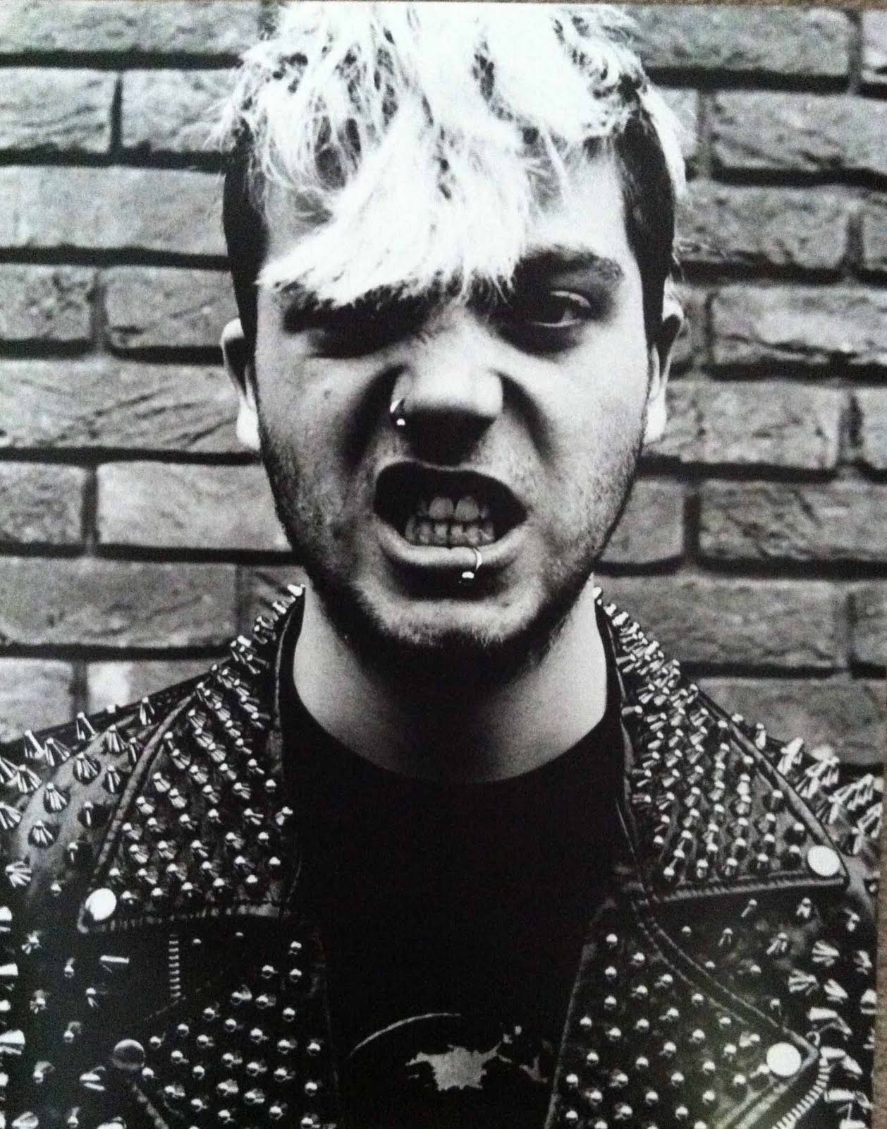
So I chose The Red Lion and decided to think about its main and how people say to you your hair looks  bit wild like a main, which I tend to get quite a lot so thats what triggered this idea. So I took this photography focusing on the hair and showing no idenity of the person.

I had tried putting a red tint over the hair, but I felt it looked too forced and the black and white photograph had better contrast with the banner at the bottom. I think the typeface works quite well.

I am reasonably pleased with how the sign has turned out, I think its a good photograph and works well, I chose this position for the model because I felt it showed the pride of the lion.

As I finished the project earlier than the deadline my tutor wanted me to do another pub sign as well with another one of my ideas that he liked as well. So that is on its way.

Wednesday, 6 April 2011

Google


This was google's header the other week. I just like it's simpicity of colours, so I thought I'd put it up :)

Monday, 4 April 2011

The Event Magazine


For this project my task was to create at least a 12 page magazine based on an event. I created this A3 16 page magazine on the event that I have previously mentioned on my blog called the Big Book Bang, which celebrated world book night. My Magazine includes photographs take on the night, my own set up photographs, interviews with the organizers of the event, information about slack space and a double page spread on the Hidden Dingbat Collective.  The centre page is like a feature page where the image is bigger than the rest of the book in width and folds out like a book bang.

I really loved this project and I am really pleased with how it has turned out. I will put photographs up soon of what the magazine looks like as a physical object as these images just shown them as spreads.

Sunday, 6 March 2011

The Great Slack Space Book Bang

 Blue Book Cover

 Orange Book Cover

For world book night Slack Space held a book event, where people came and listened to readings and picked up books. As part of this event The Hidden Dingbat Collection were illustrators for the event and I was also invited to take part. We all had to create an illustration to do with the book 'The Life of Pi'. I did a book cover, focusing on the tiger but representing it just by it's teeth. I did the origional cover in blue to keep with the theme of Pi being stuck on a boat in the ocean, and then I did a second one in orange to pick up more on the tiger.

Thursday, 24 February 2011

Live Project Posters

Generic Poster


These are the seven posters that myself and my two team members created to promote the MA courses at my univeristy. They still need editing and better photographs but this is the concept.

The idea is that its opening a door into the future, because these are being aimed at potential students. For the generic poster, advertising all of the courses, is the set of keys colour coded to unlock the doors for the courses on the individual posters. The key also is made up of the N from the NUCA logo.

The 6 individual posters have photographs of the facilities for each subject. This is just to show the idea and combination of illlustration and photography. Really the photos need to haev more perspective and be more dynamic. But I think these illustrate the idea well and show how they work as a set of posters.

Overall, we have been really pleased with how the posters have ended up and have worked really well as a team :)

Sunday, 20 February 2011

Book Cover Project

 Mid to Late 19th Century

 1930's

1940's

For this project we had to design covers for a series of books called Short and Sweet. I had to design a logo, the cover and use typography to represent the era of the book. I wanted the series to look like a set so I choose to have the same style throught the designs but change the typefaces on the front cover to suit. I also chose different patterns for the boarders that fitted with the era of the books. I wanted to colours to be quite strong but also sophisticated, so I chose these musty dark tones.

I really enjoyed this project and I am pleased with how my book covers ended up, there were several different versions before the final ones.

Sunday, 13 February 2011

A Conversation With David Pearson


For my contextual studies report I am writing about book cover design, focusing on Penguin Books and how technology such as the Kindle and Ipad are affecting the publishing industry. David Pearson a designer who has worked with Penguin. He has designed a number of their covers, such as the Penguin By Design book, which I have shown previously in my blog.

David recently gave a lecture at my uni and I took the opportunity to contact him by phone after the lecture, to give him a short interview about his thoughts and opinions on what the future of books will be, and how the Kindle etc will effect book cover design. David gave some really interesting and in depth answers, which really helped me with my report and got me thinking about what the future of books will be. I really appreciated his time and he was a really nice and chatty character.

Golf Book

 Golf Club Competition Book Cover

My mum asked me to design a cover for an A4 book for her golf club for people to sign in. My mum wanted the cover to be simple just to cover up the plain cover of the note book. I didn't have much time as it was a bit late notice and I had other work to be doing. So I came up with this, the green words in Gill Sans are all different golf terms and the title on its side is in Baskerville Old Face. I didn't want to do the whole book in green because I felt it would be too obvious so I chose to make the dominant colour dark grey to contrast witht the green type, spine and end folds.

Thursday, 3 February 2011

Live Project

Today I got offered to be 1 of 12 people from my course to take part in a live biref. The brief is to design posters to advertise the MA courses at Norwich University College of the Arts. So excited :)

Wednesday, 2 February 2011

Friday, 28 January 2011

Books

 "Just My Type" by Simon Garfield

"What is Typography" by David Jury

These books are currently my two most influential reads. I have never been a good reader and its very rare for me to be drawn into a book as it seems to take me about a year to read one, and it most definitely not my stong point.  However,  these books hold my interest, you just learn more and more from them and they are feeding my passion for typography.

Stationary Design

Buisness Card (left - font, right - back)

Letter Head

For this project I had to choose an association or society (could be made up) and design a letter head, business card and compliment slip. I decided to make up the Enigmatic Society and used the theme of representing an enigma/mystery with question marks. I created stencils and set up lights to create shadows of the question marks as my logos for the society. The compliment slip is still not quite finished and I also want to make an envelope for the letter but here is the business card and letter head. (The back of the buisness card looks black on the screen but its actually dark green)

As well as the theme of question marks and shadows I also wanted to use the type in an enigmatic way by placing it in unconventional places on the letter etc, so that the member of the society would have to move the paper around to read it and ask themselves why the text was out of place. The images shown are just on bright white backgrounds, but I am planning to print them on off white paper to compliment the green tones better.

I am reasonably pleased with how the project turned out. However, I feel I could have executed it better than I have, but I think I have represented the society quite well and I got the chance to be quite creative by making stencils, photography and playing around with lighting.

Thursday, 20 January 2011

Booklets


"A Brief Introduction to Typography" Booklet


"An Exaltation of Larks" Booklet

These two spreads are taken from my assessment portfolio from last term, showing two different booklets I designed. The images aren't brilliant quality and the smaller text is hard to see but you get the main gist.

The first booklet is a brief introduction to typography.

The second booklet is called "An Exaltation of Larks" which was based on how to use expressive type.

Thursday, 13 January 2011

Jamie Oliver

A2 Poster
(hard to see text on this small scale)

Invitation

Hand Painted Typograhic Identity

For my first project of term two my task was to create a typographic identity for Jamie Oliver, as well as an invitation and poster for his show. I created my typographic identity by hand painting these letters to make them look like fruit and veg - relating to his healthy eating campaign. On the invitation there is Oliver handwritten underneath the identity, but the main part is what is shown. For the poster i took the top of the carrot (j) and enlarged it to fit on an A2 poster, and used the space around the illustration for the text.

Saturday, 1 January 2011

Quotes poster

Quotation poster

This is a project that I did last year where I had to design a poster based around a quote. I chose the quote "Coffee isn't my cup of tea". I had many different ideas and stages in creating this poster and this is what I ended up with, its not as illustrative as I would have initially liked it to be but I decided to focus more on the type and how to incorporate with my photograph. It is an A2 poster, but the type is probably quite hard to read as a small scale on the screen.

New Years Eve

These are the cupcakes I made and decorated for a new years eve party :)